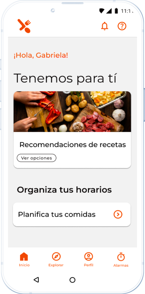
App mobile · 2023
Timerfood
Do you remember the lockdown and how we are now facing a new normal? Remote work and home responsibilities have led us to somewhat neglect our diet.
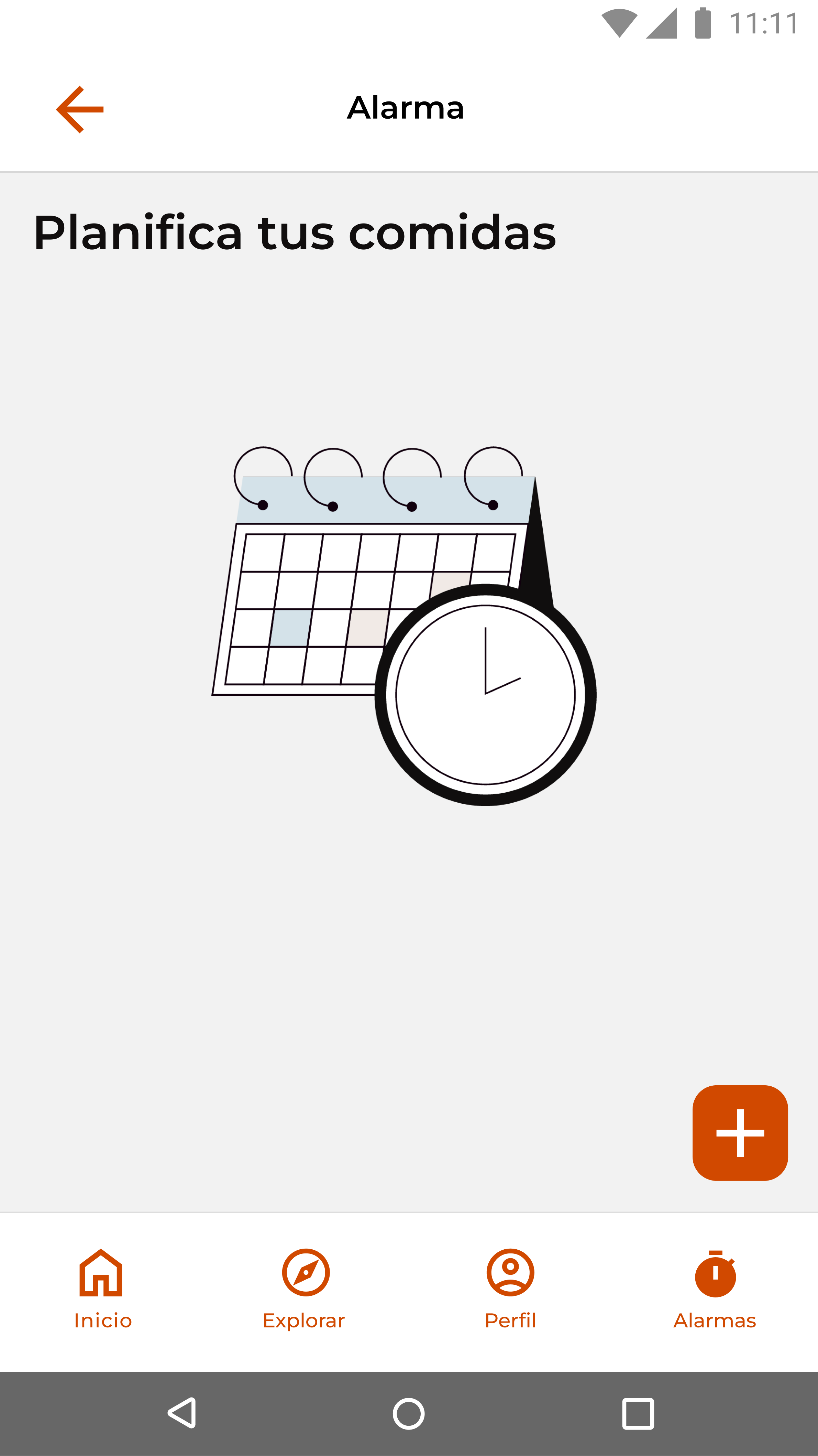
But what if you could schedule your cooking tasks in a fun and simple way, regardless of the ingredients you have at home?
- 46,234,830 people between 25 and 45 years old in Argentina in 2022 have highly demanding jobs, increasing productivity due to workers dedicating 9% more time to their remote jobs.
- 21% of Argentinians eat outside their homes at least once a week or more often.
- The main causes of food waste at home are related to consumer behavior, either because items do not meet the requirements of shape, size, or appearance that we usually associate with "quality."
- The use of delivery applications during mandatory isolation increased by 400%.
Problem definition
- People who hold highly demanding formal jobs.
- They have acquired less agility in organizing and coming up with varied and nutritious homemade meals.
- Frequent consumption of low-nutritional quality foods made outside the home.
- Lack of knowledge about their composition, impacting their health and economy.


What can be improved?
- Use motivation.
- Expand the necessary knowledge about how food influences health.
- Show the impact on their health.
- Emphasize the importance for their economy.
How can it be achieved?
- It can observe the composition.
- Status.
- Quality.
- Quantity.
- Specifications based on a list of pantry products and encourage the challenge of cooking.

Why is it necessary?
-

HEALTH AND WELLNESS
"Promote interest in healthy, reliable, and conscious nutrition by stimulating domestic activity, with the purpose of reducing disease risks." -

RESPONSIBLE CONSUMPTION
"Become aware of our level of consumption and expenses that influence the capacity of resources for waste processing."
Archetypes
Gabriela
Social communicator
She likes to go for walks and spend time with family, especially hosting friends. Apart from work, she is capable of including other activities. She likes to use social media. When it comes to cooking, she doesn't mind. With what she has at home, she can imagine what to make and what she might crave. She tries to do grocery shopping every week to ensure that what she buys will be fresh during the week. She doesn't worry much about expiration dates of some products, but she invests a lot of time in keeping track of things.

Carlos
QA Analyst
He shares with friends; among his activities apart from work and university, he cooks for himself or when he gets together with friends at his house, although he is not an expert. He tries to be responsible with what he has learned, cooking according to what he has and craves. Sometimes he takes pictures of the dish. He does grocery shopping every week, without a list of products, buying what he thinks of, looking for economy.

Benchmarking
#1
Whisk:A recipe app that allows creating activities such as networks between communities.
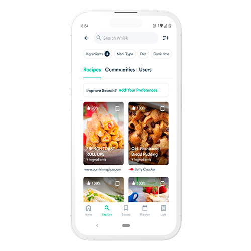
| Strengths | Weaknesses |
|---|---|
| Search with a lot of variety. | Search is difficult due to distractions from other content. |
| Navigation is intuitive and direct. | It is difficult to quickly find information as expected. |
| Explanatory and personalized information. | There is a lack of space between elements. |
| It is very flexible with the needs of users. | Ingredient icons can make reading complicated. |
| Consistent between screens. | Desirable to have it in Spanish. |
| Icons, buttons, and images are relatively easy to understand. | |
| It encourages users to stay within the application by providing access to social media content. |
#2
Sidechef: A recipe app with more formal content and also the creation of groups and communities.
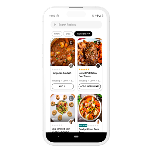
| Strengths | Weaknesses |
|---|---|
| Quick search with necessary information. | Does not allow returning to an interrupted query. |
| More specialized content. | Desirable to have it in Spanish. |
| Consistent between screens. | Moderately encourages users to stay within the application for other content interests. |
| Icons, buttons have easy readability. |
#3
SuperCook: A recipe app that presents multiple alternatives, but its content is based on recommendations from internet pages.

| Strengths | Weaknesses |
|---|---|
| Provides quick alternatives to what users need. | The design does not encourage users to stay engaged. |
| Allows planning based on available ingredients. | Navigation between screens is not consistent. |
| Simple navigation and direct search options. | Lack of personalization for specific user needs. |
| Offers recipes that users may not have thought of. | Desirable to have it available in Spanish. |
MVP
- User Registration: Easy access to create and manage user accounts.
- Language Selection: Adaptable interface based on users' preferred language.
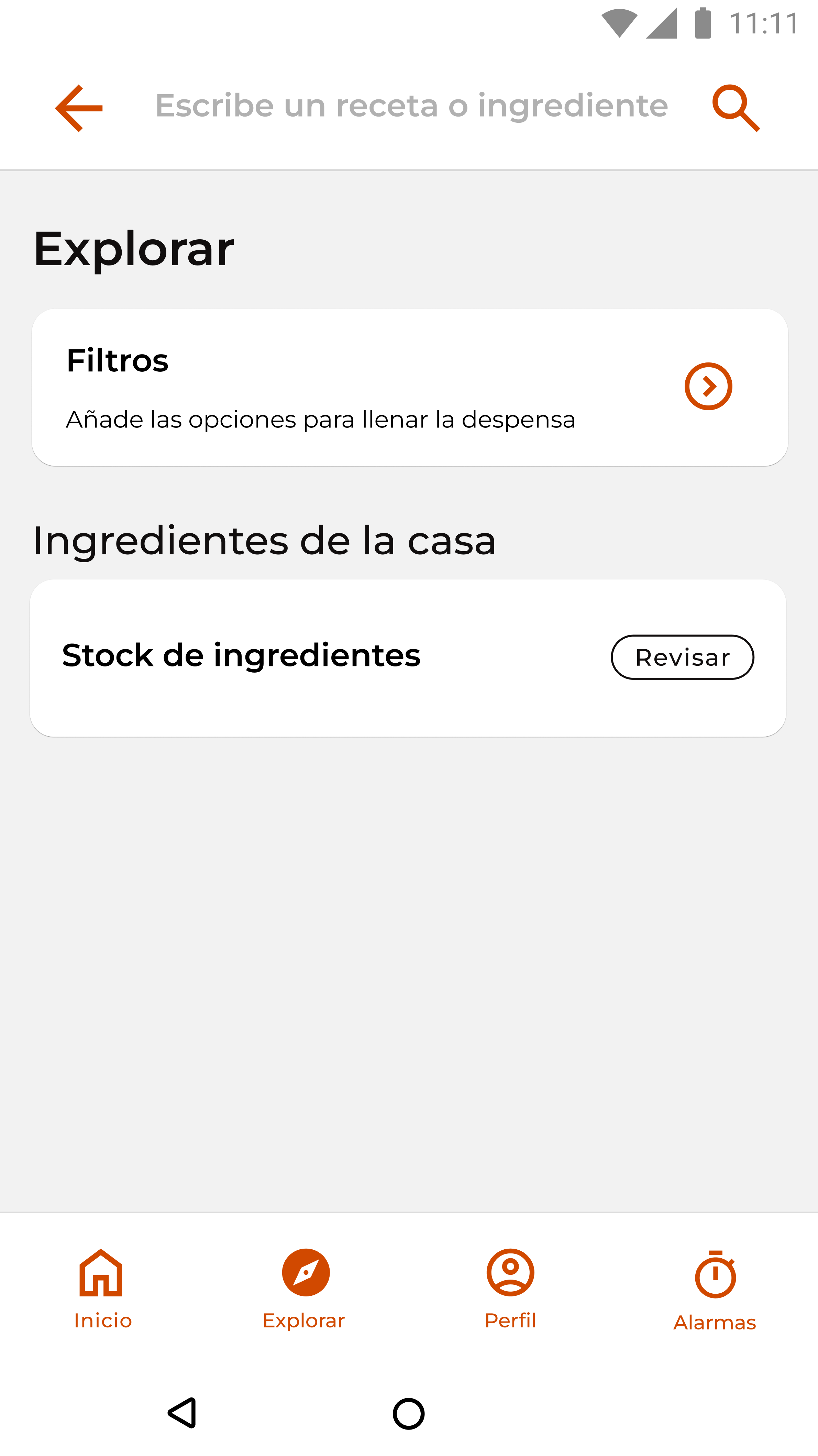
- Ingredient Viewer: Allows users to browse their available ingredients.
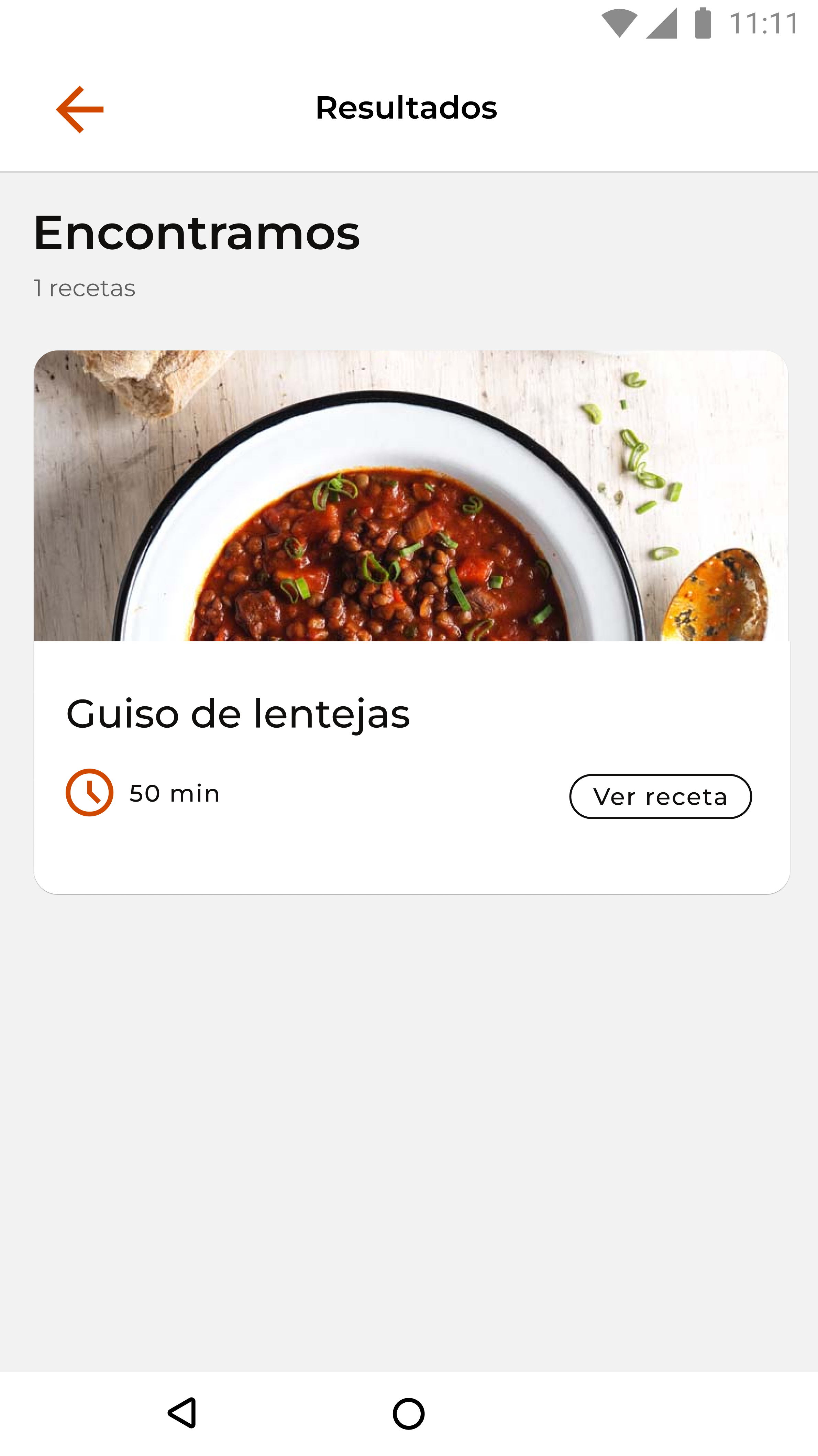
- Recipe Suggestions: Provides recipes tailored to the user’s available ingredients.
- Ingredient Input: Enables users to add ingredients for personalized recipe results.
- Location Selection: Adjusts content based on the user’s region.
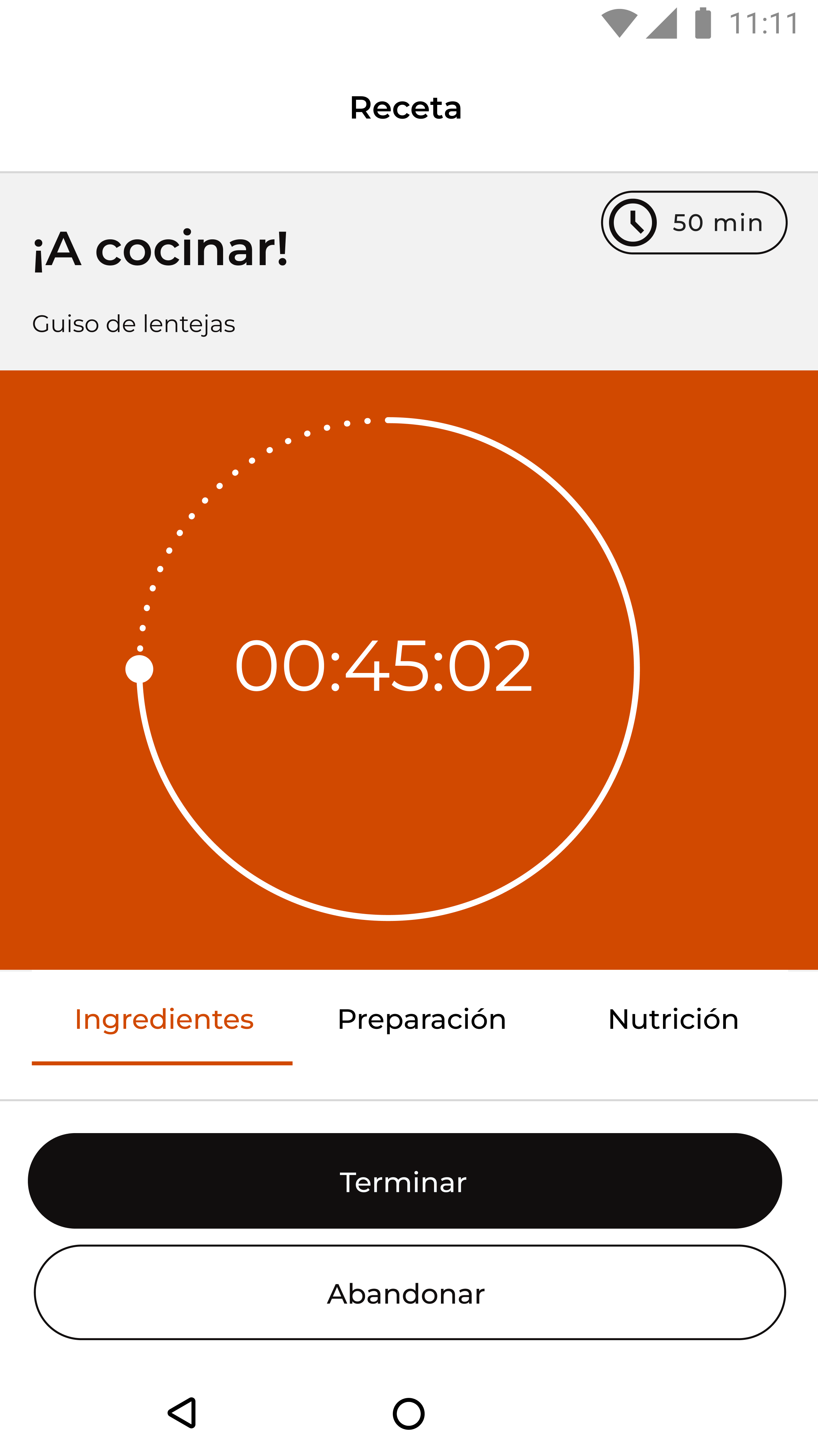
- Preparation Instructions: Step-by-step guidance to simplify cooking.
- Diet Selection: Offers recipes aligned with specific dietary preferences or restrictions.
- Ingredient Calculator: Automatically adjusts ingredient quantities based on serving size.
- Nutritional Information: Displays the health benefits of each recipe.
- Brand Challenges: Engages users with gamified cooking tasks and rewards.
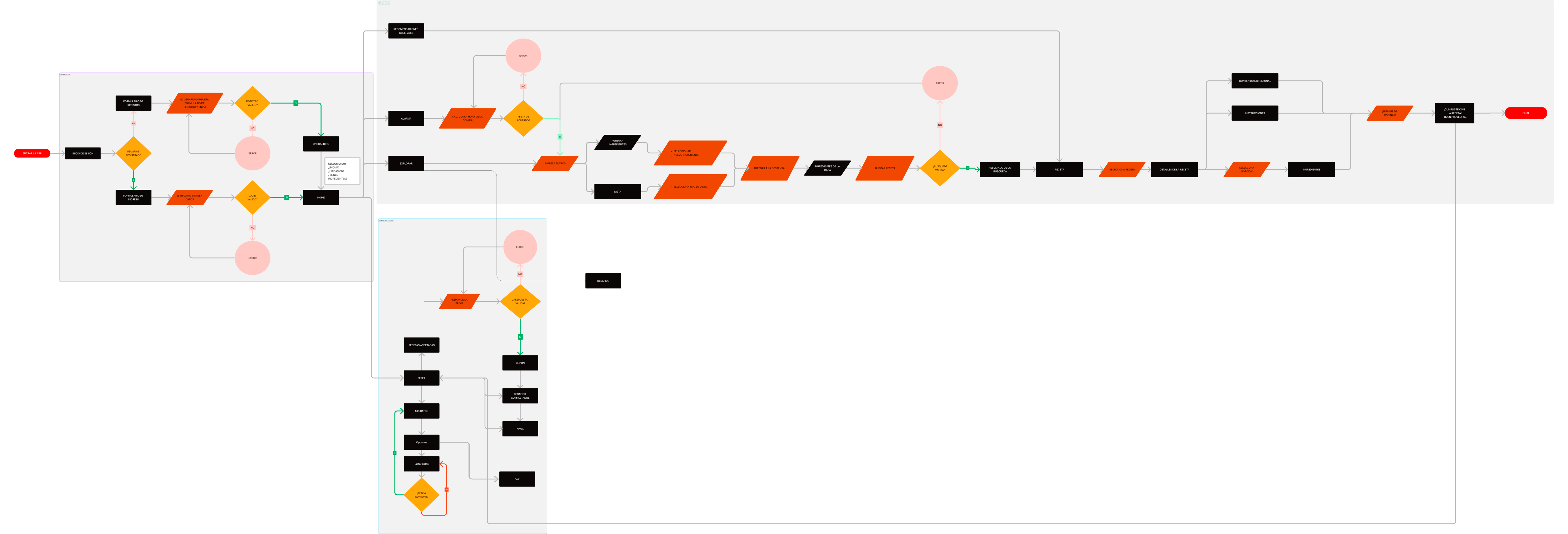
User flow
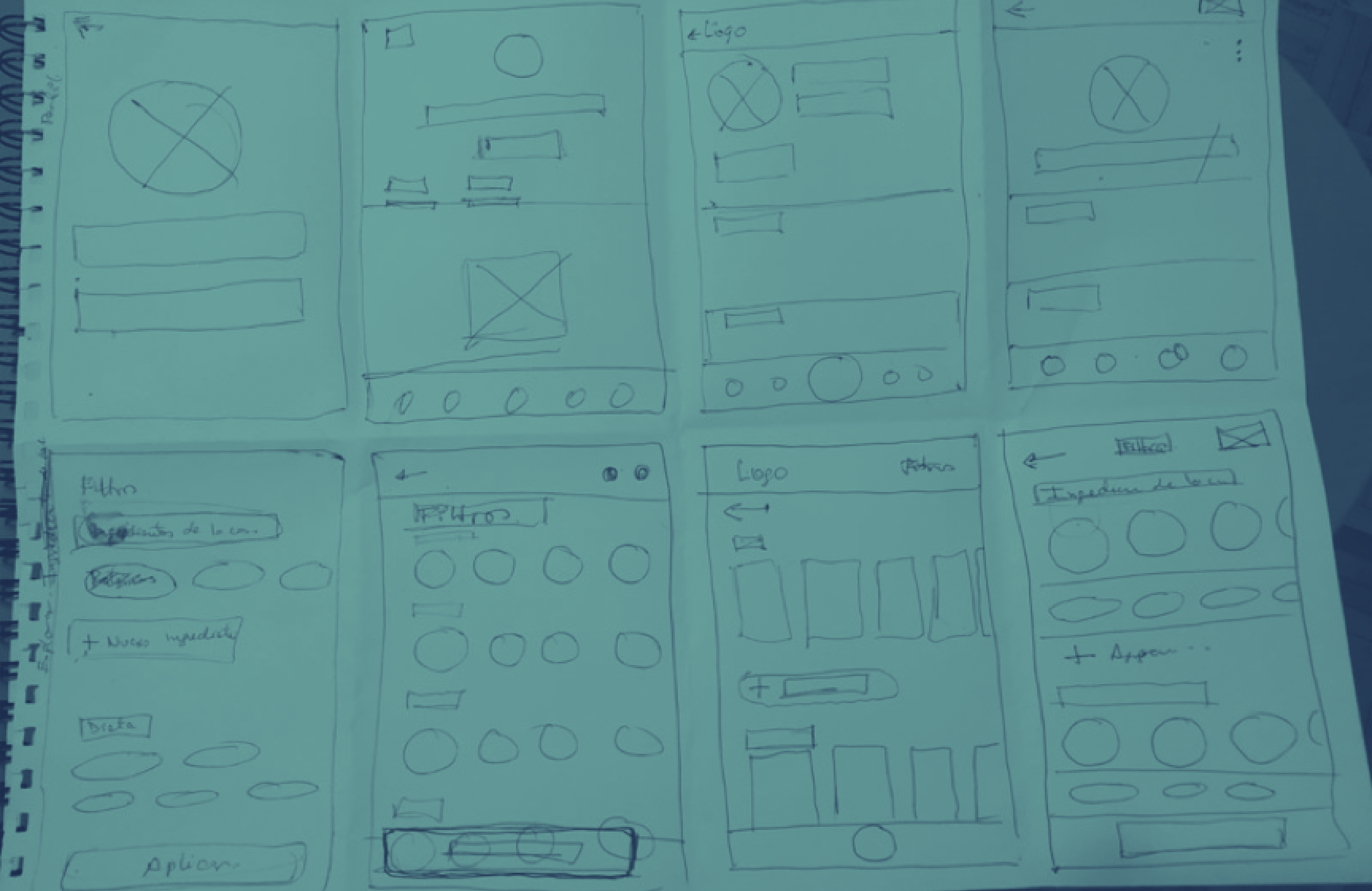
Sketching
Initial hand sketches were created using the Crazy 8 technique, dividing the format into 8 sections to develop 4 distinct models for the 2 most critical pages of the application. Afterward, the process continued with hand-drawn prototypes for other key pages, focusing on features deemed important for functionality and usability.
Finally, the best ideas were selected based on their alignment with what was functional, necessary, usable, and feasible. These selections were also consistent with the flows determined by the Information Architecture and User Flow, ensuring a seamless user experience.
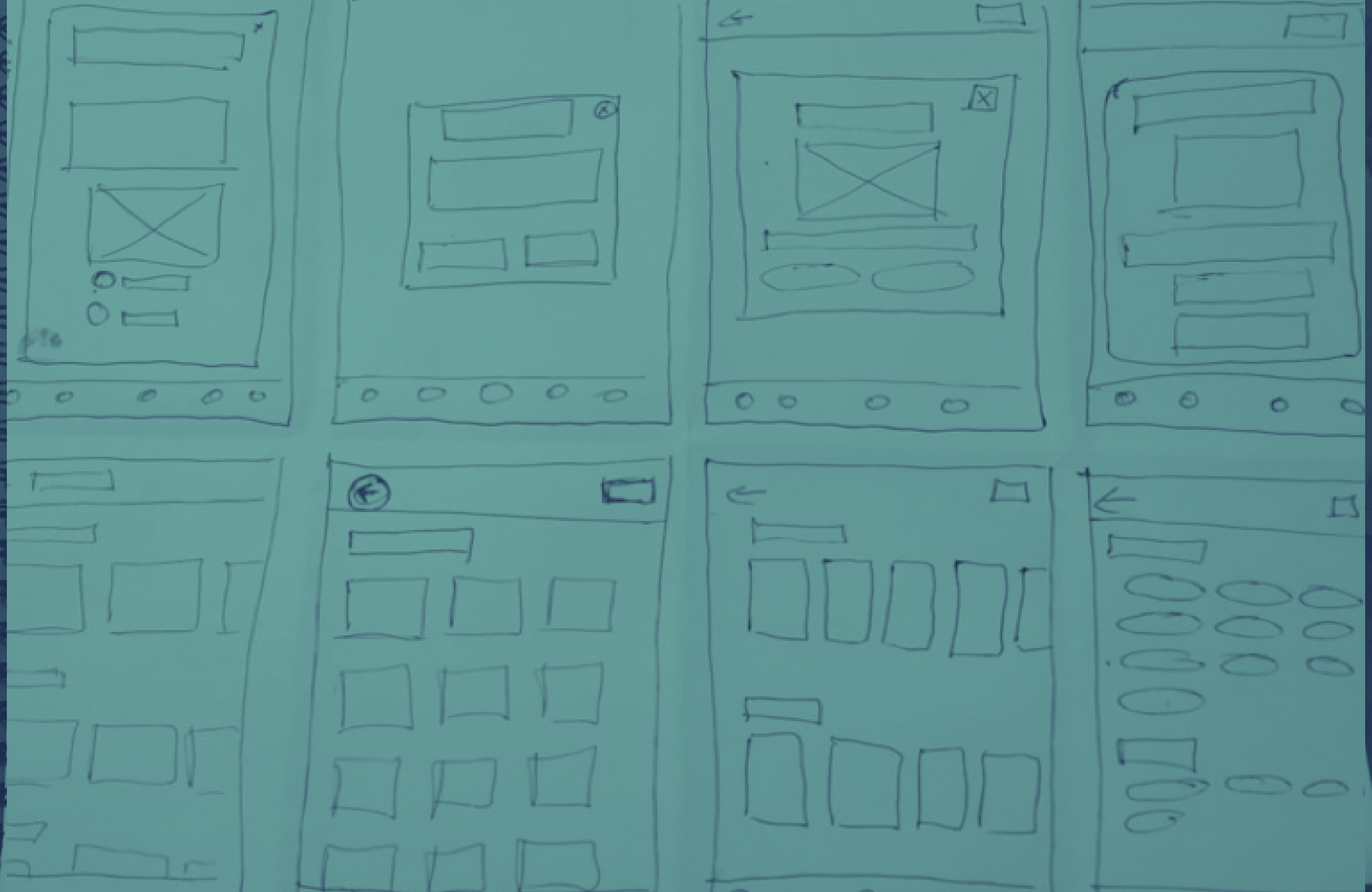
Wireframes

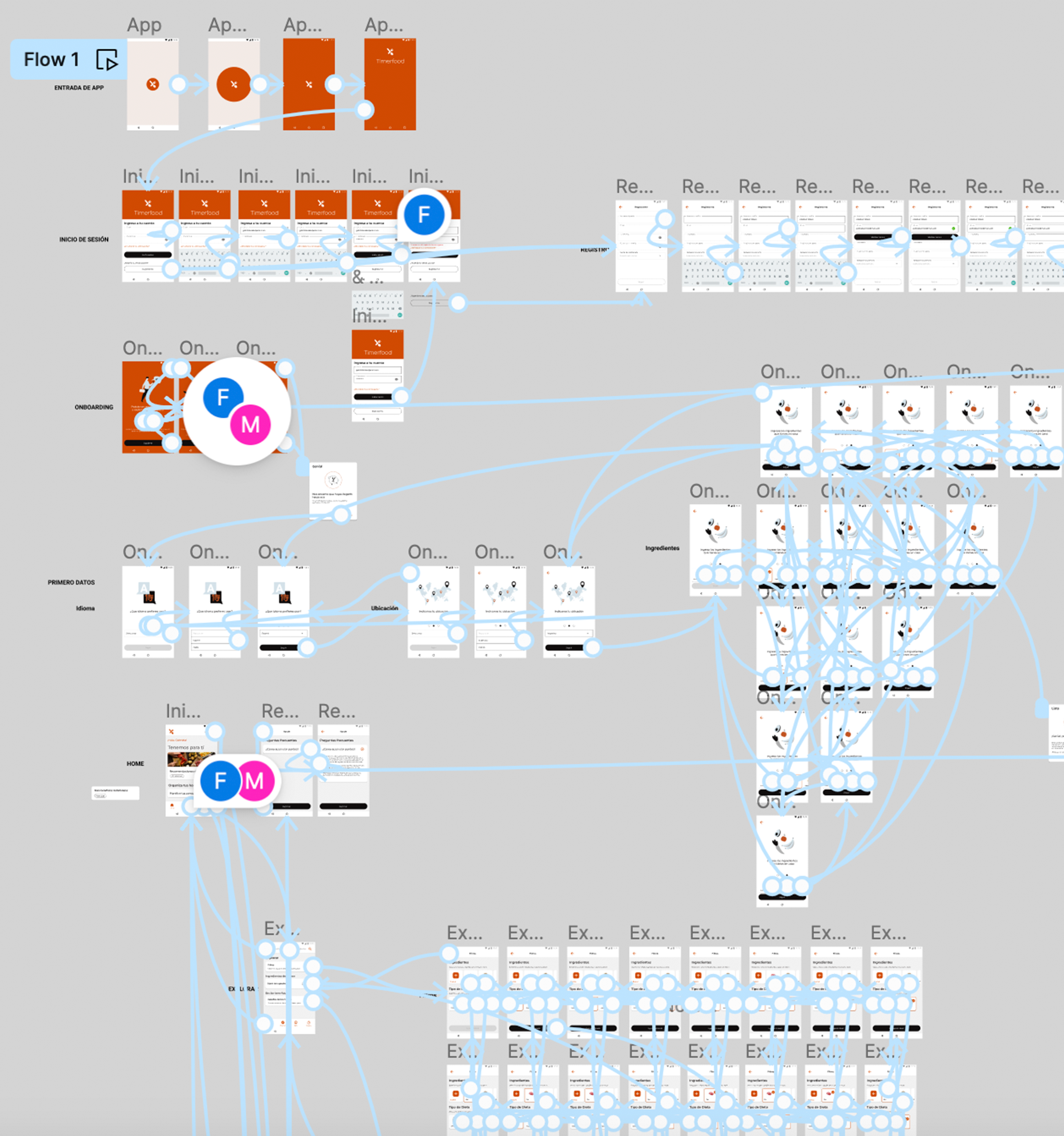
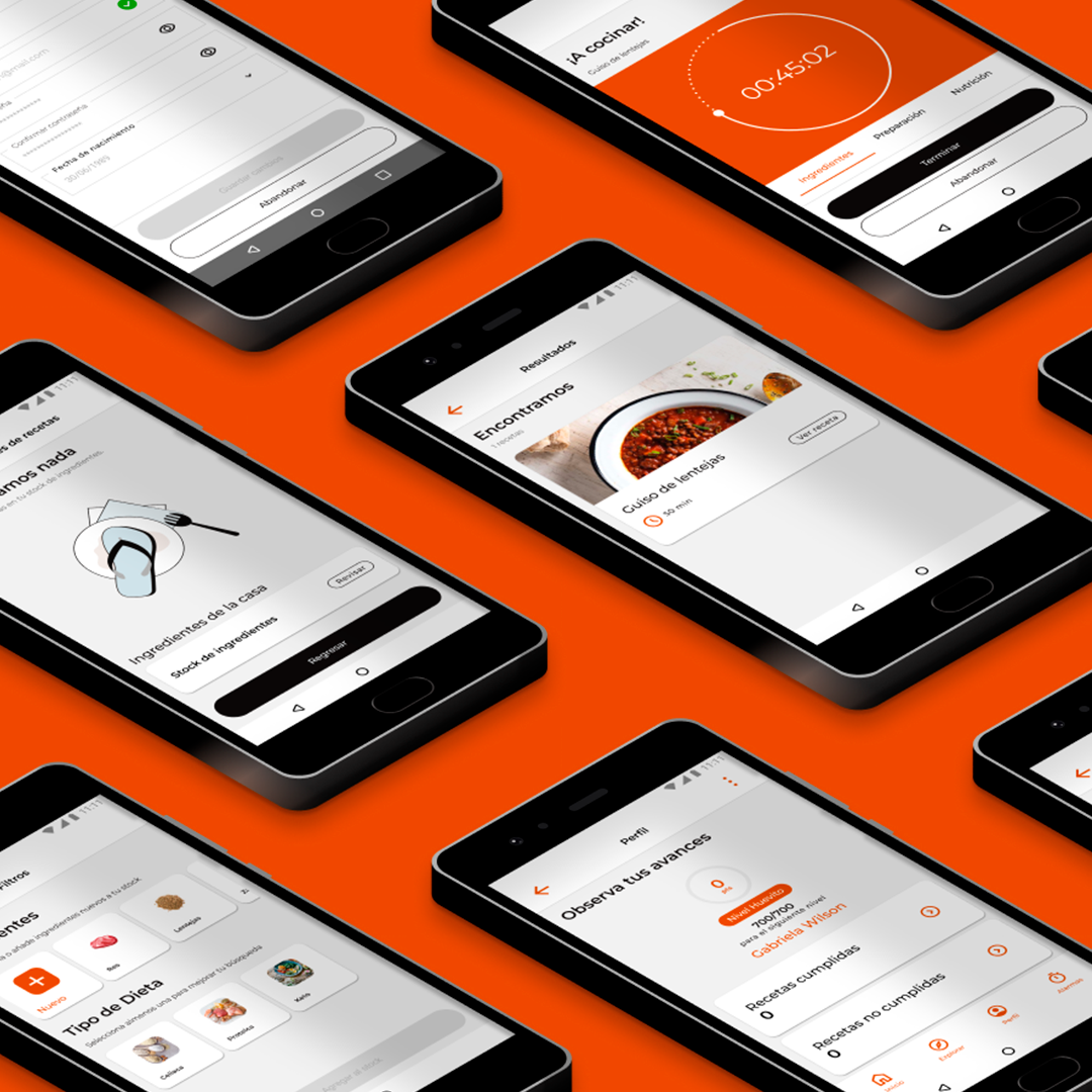
Prototype
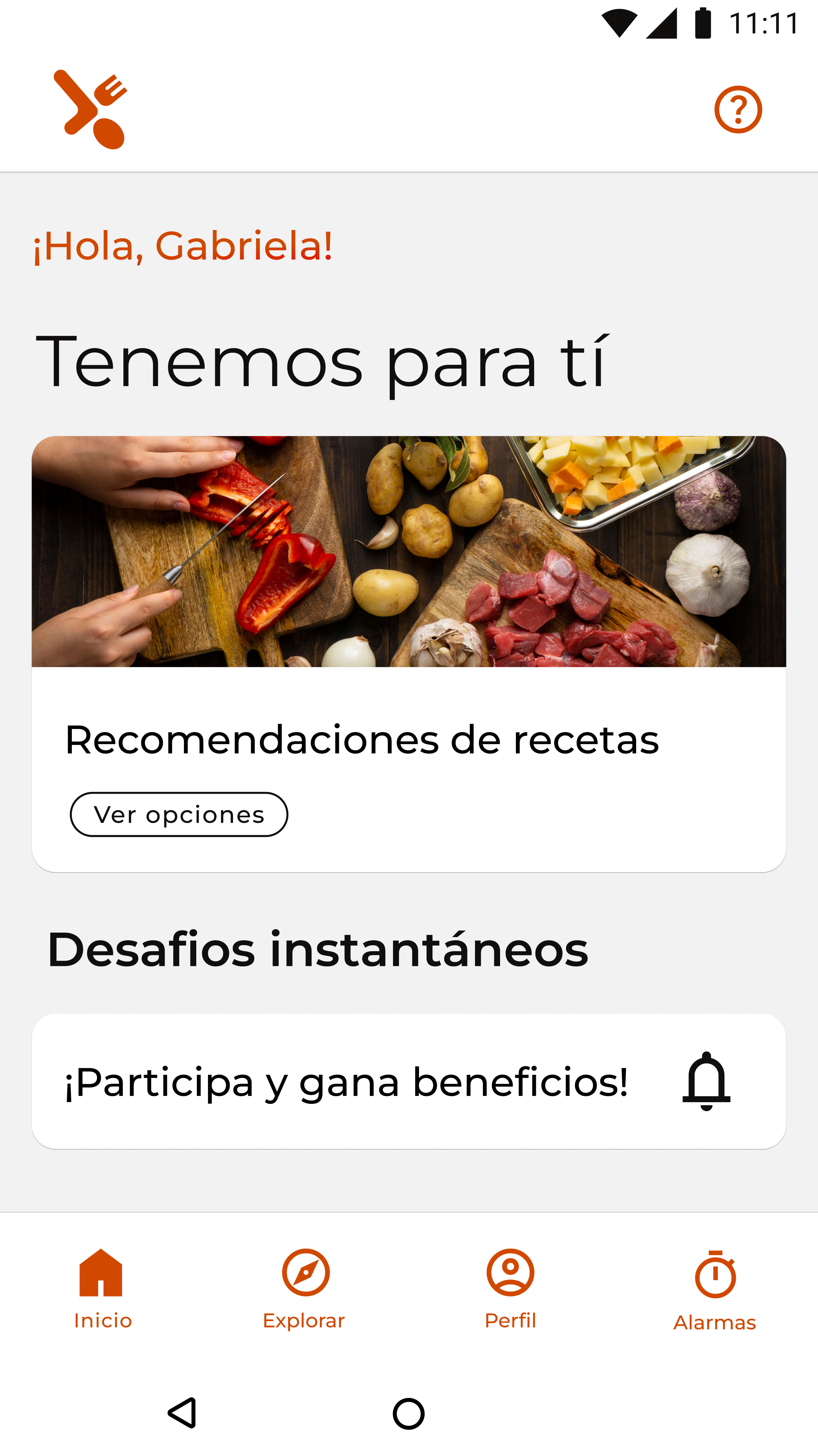
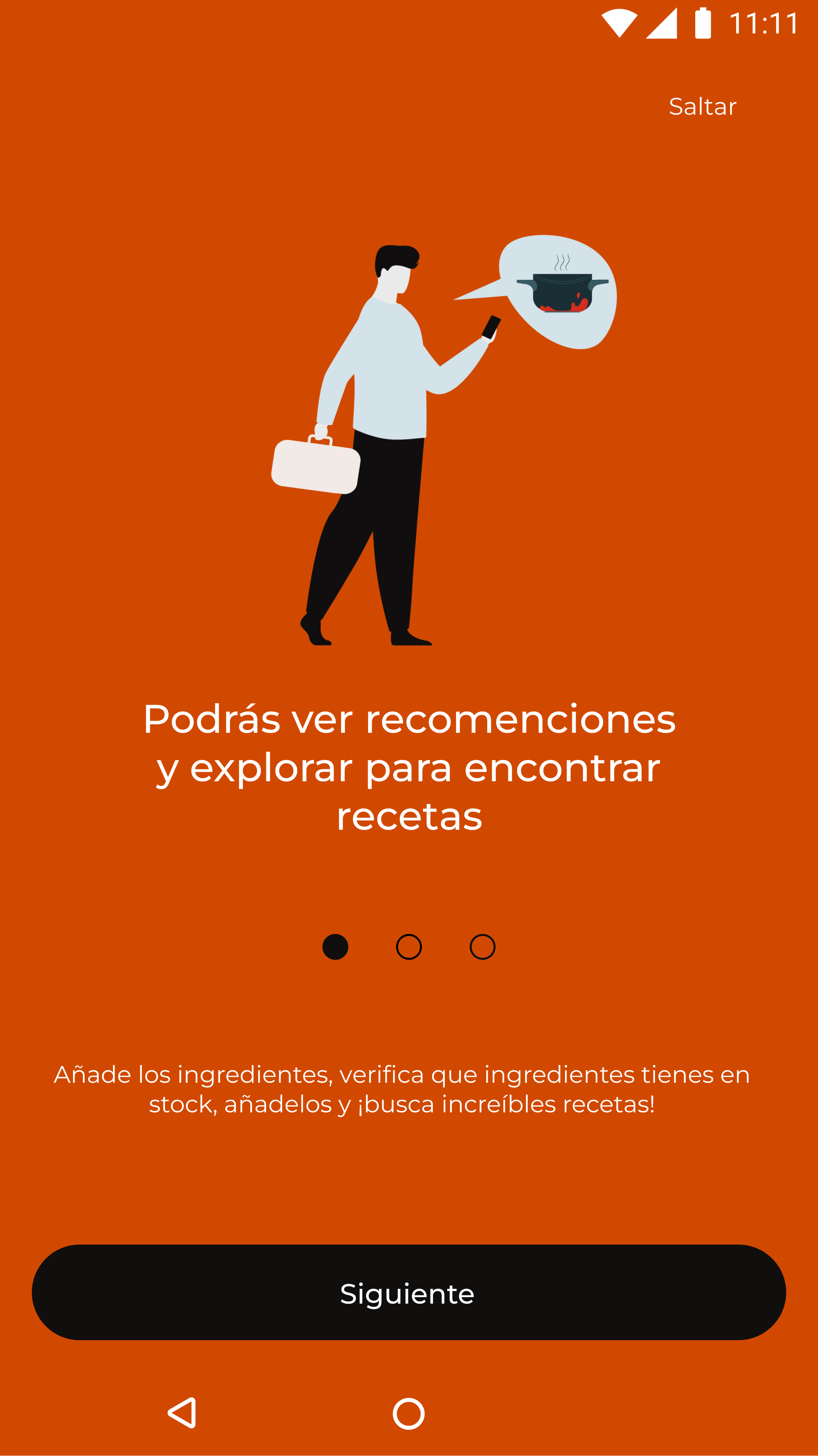
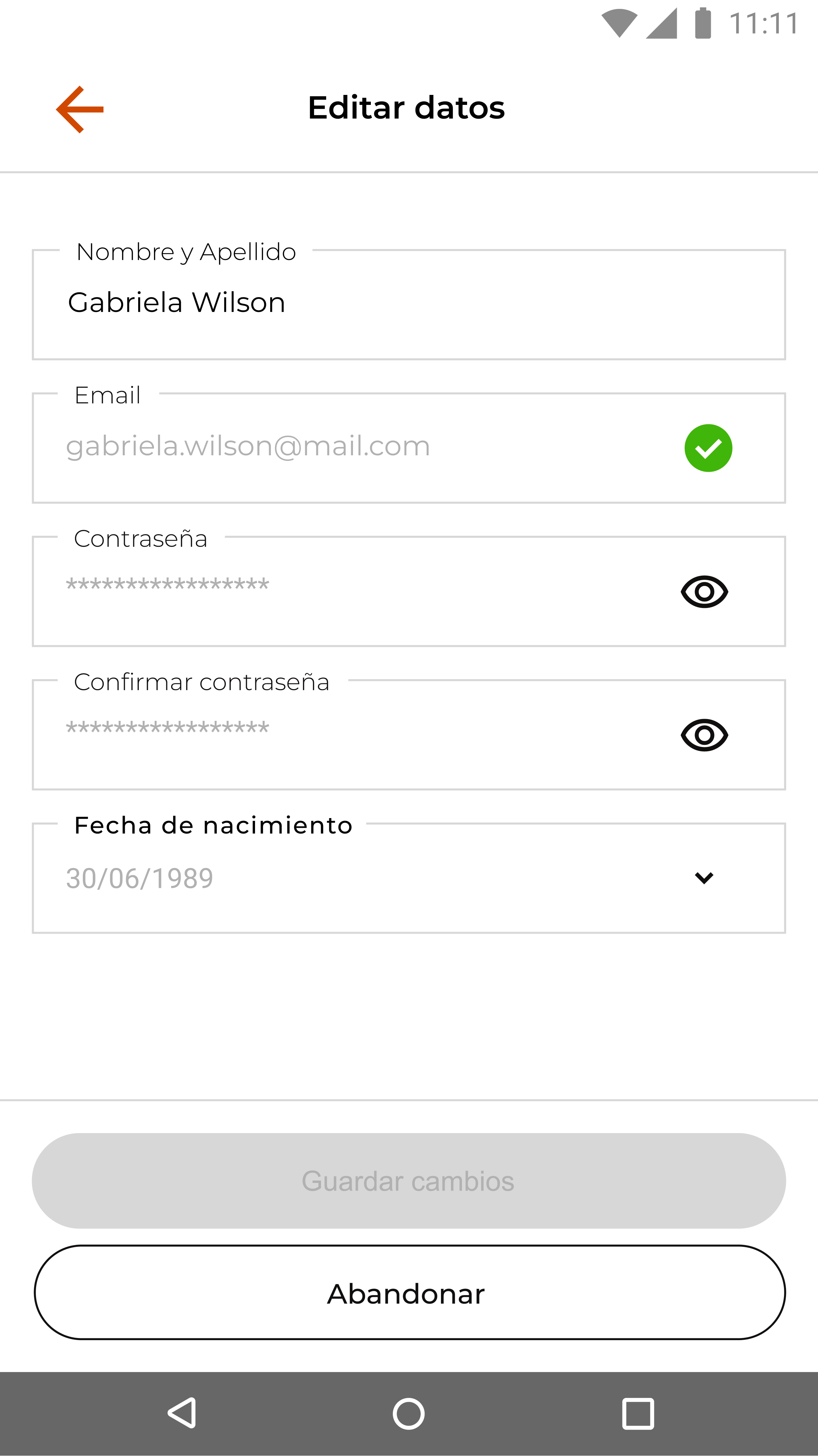
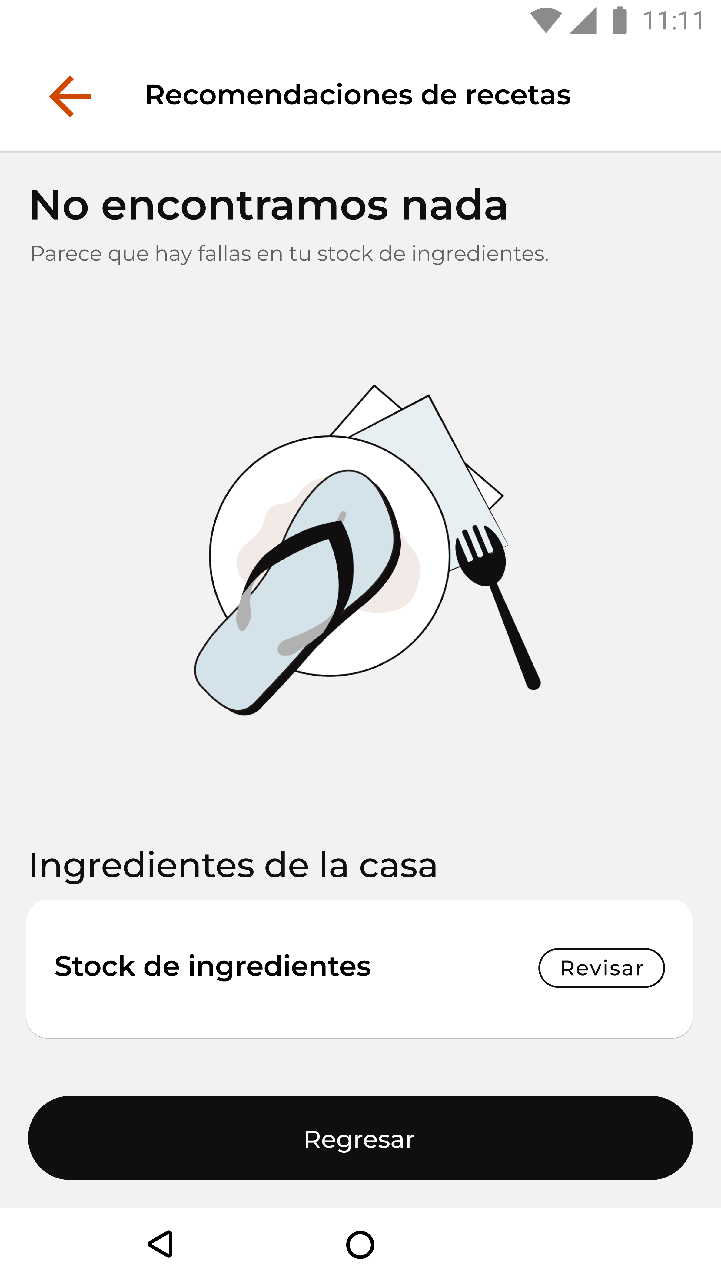
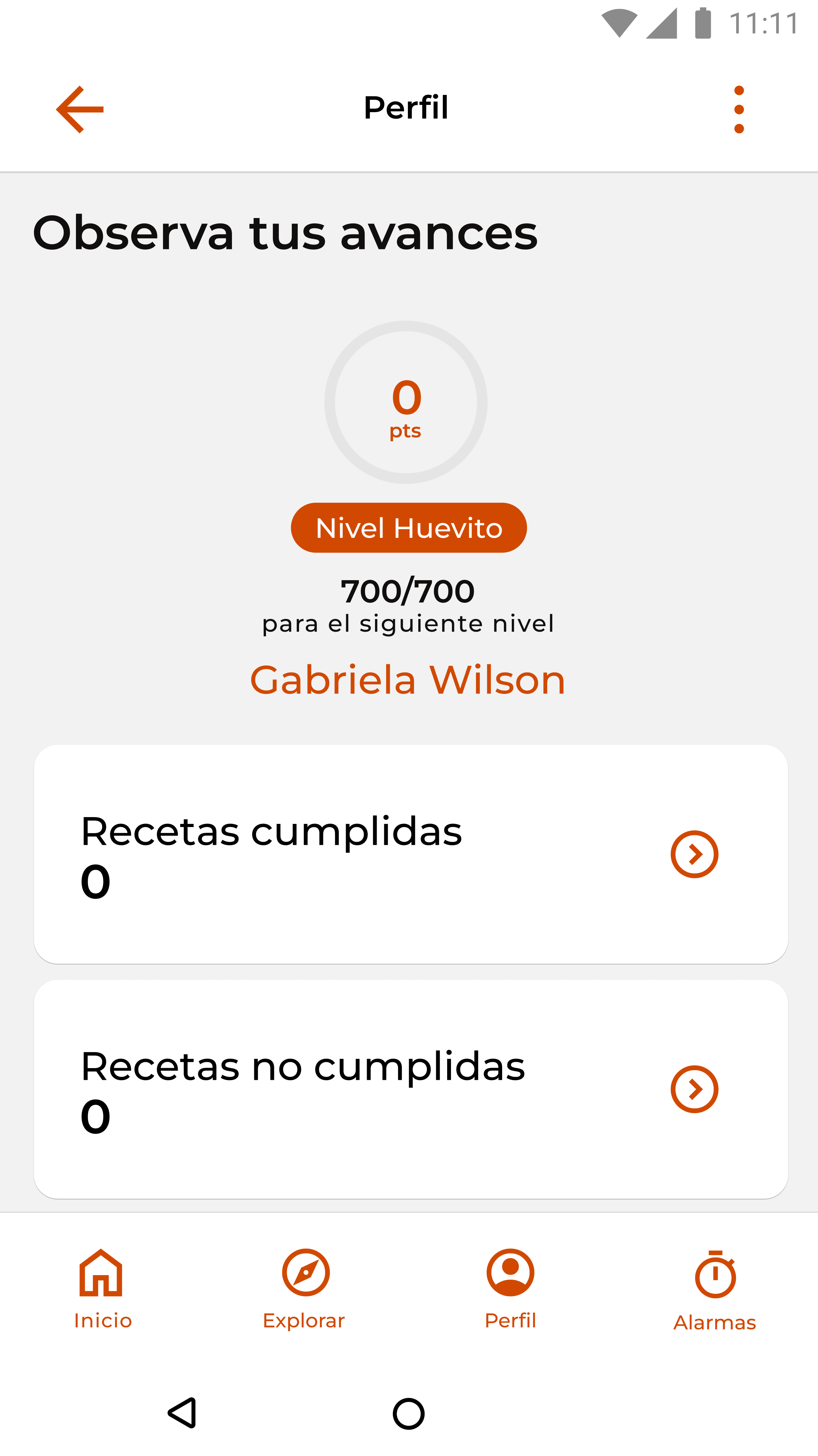
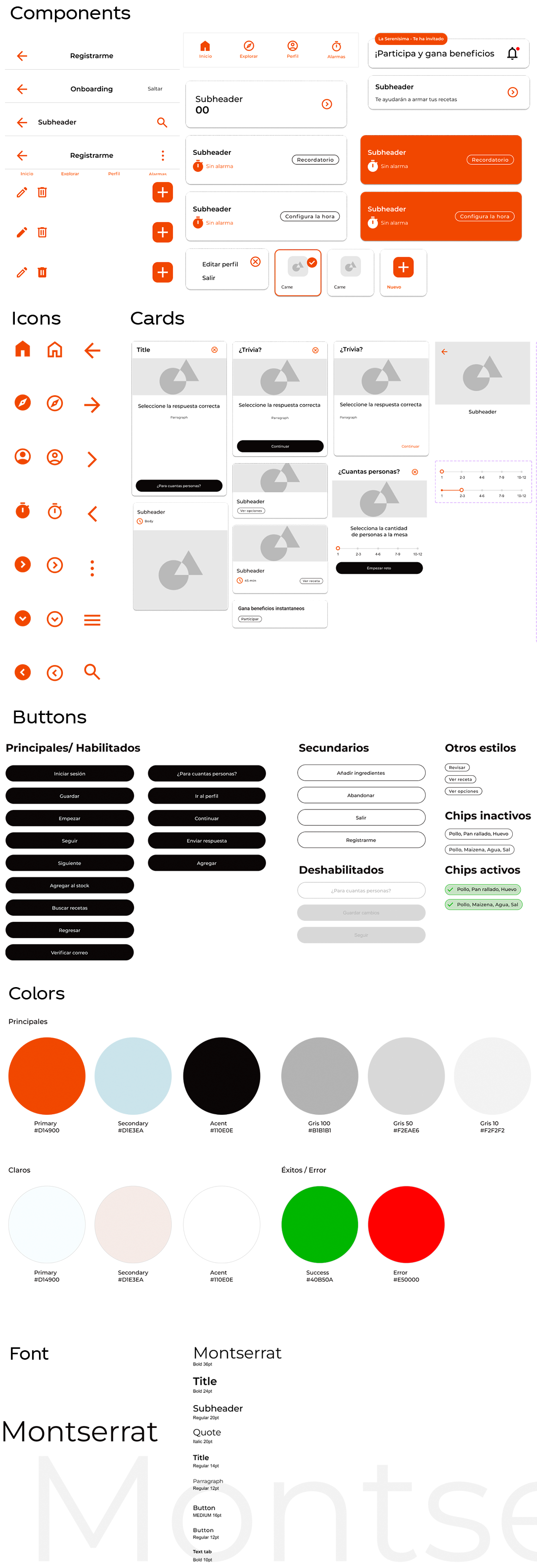
UI Kit
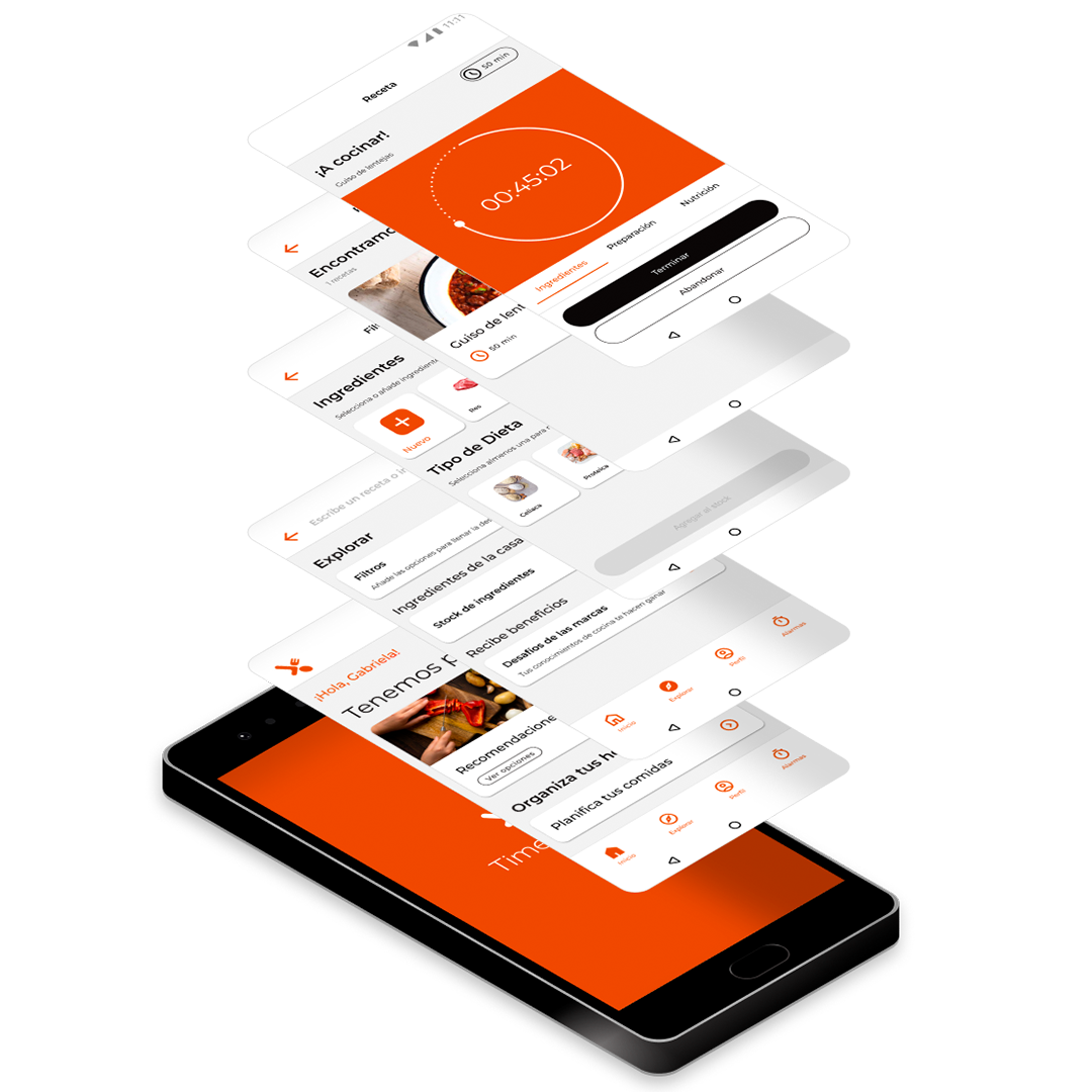
- Components
- Cards
- Icons
- Buttons
User testing
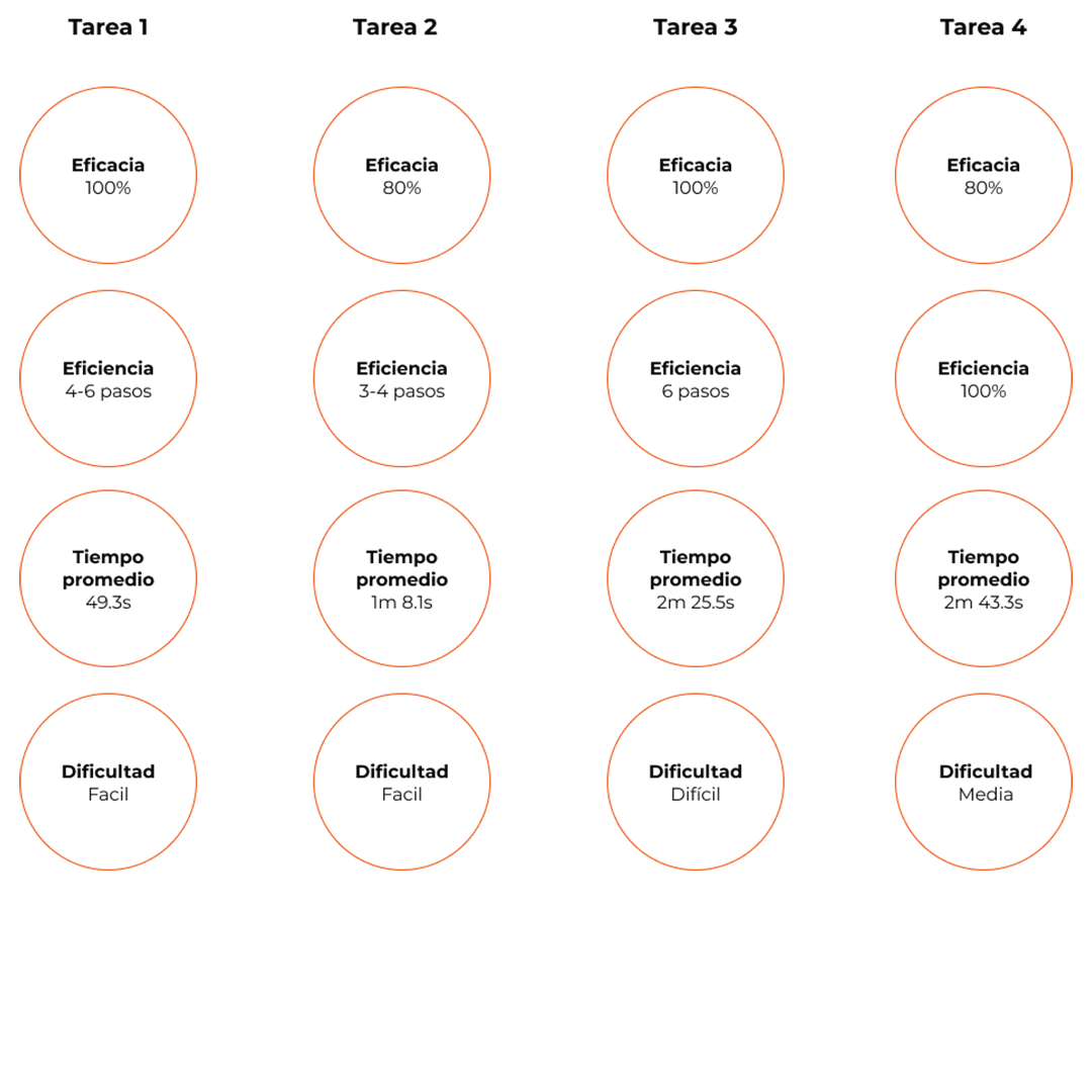
| What worked | What didn’t work | Applied improvements |
|---|---|---|
| 4/4 users successfully registered, achieving a 100% success rate. | 4/4 users struggled to understand that certain features, such as the keyboard, were inactive because it was a prototype. Additionally, they didn’t realize that, as new users, they needed to begin with a new registration. | Adjusted spacing and emphasized the login section to make it more noticeable and user-friendly. |
| 3/4 users were able to navigate, read, and complete the entry. | 1/4 users could not successfully complete the task due to technical issues with the platform. | Introduced functionality in the stock of ingredients, allowing users to add new ingredients if needed. From there, users are guided to filters and ingredient selection for a more streamlined process. |
| 4/4 users successfully completed the task. | 4/4 users experienced confusion when searching for a recipe. They frequently navigated to other modules or pages, which delayed the completion of the primary task. | Added a more descriptive text alongside a badge indicating a pending challenge. This feature aims to engage users by highlighting opportunities to earn rewards and encouraging interaction with the app. |
| The prototype’s lack of color and visual appeal made the interface less engaging, reducing user interest in exploring the app. |